
Check out the prototype here.
For Project 01, the NYC MTA was my inspiration. As someone who’s new to New York from Los Angeles and who grew up in Middle America (hello, Kansas City, MISSOURI), the subway system here really intrigues me. I think it’s awe-inspiring how over 100 years ago, people figured out how to move people around this metropolis underground, and it’s doubly fascinating that it still works and is the lifeblood of this great city. I often imagine how different the system looked when it opened in 1904, and I imagine the citizens of that time being just as fascinated. It’s cool!
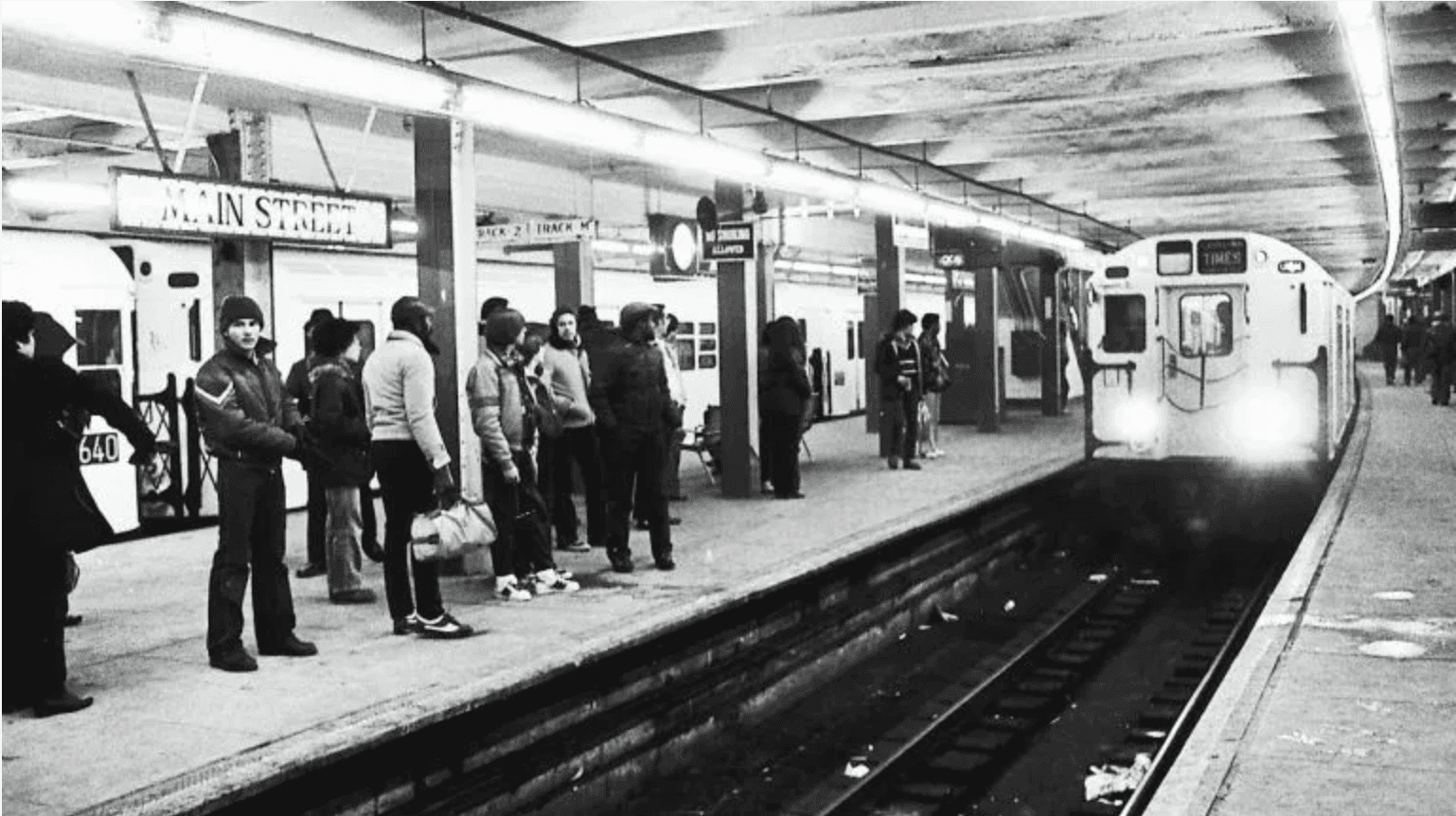
I knew I wanted to do something MTA related for this project, and I thought it’d be interesting to use real-time data to map out real-time movement of the city. My grander vision is to build an interactive map that shows the various train lines and subway stations and have them react to New Yorkers’ movements across the city—for really busy train lines, the lines on the map would grow thicker (less busy ones would conversely shrink thinner), and the individual train stations would grow and shrink (and perhaps glow) based on traffic. Theoretically, you’d be able to look at the map and see where people are migrating to at any given moment. A big concert at Barclays Center? You would be able to see how the various train lines and stations would accommodate that rush to Brooklyn in real time.
So for Project 01, I decided to build an MVP that showcases an MTA station detail card. Imagine you’re looking at the interactive map but decide to tap on an individual station. What information would you see? This project aims to solve that. This project uses the NYC Open Data MTA station dataset and the dataset includes the station name, the borough it sits in, what routes it services, the structure type of each station and whether or not it’s accessible.
To bring this to life, I referenced the New York City Transit Authority Graphics Standard Manual for visual design inspiration. Designed by Unimark International (Massimo Vignelli and Bob Noorda) in the 1970s, the branding used throughout the MTA is classic and it works really well when it comes to orienting riders on where they currently are and telling them where to go. When I came across the manual almost a decade ago, it stuck with me because it showed how beautiful branding and storytelling can be done through simple design. I wanted to mimic that in my prototype. I used the same orange from the manual’s cover as my background, and I also used the Helvetica typeface throughout. I deliberately built the detail card with white space in mind so the pertinent details stand out, and I even designed my own version of a retro style MTA logo (it lives on a public repo, and I don’t want to get sued!).


Illustration is my bread and butter, so I wanted to figure out how to incorporate that into the experience itself. I decided to use the station structure data type as the thing I brought to life with illustration, so I illustrated 6 scenes that coincide with each of the 6 structure types. In the end, the design and illustration complemented each other really well. I am pleased with how the look and feel turned out.


From an interaction standpoint, the prototype fetches live MTA station data from the NYC Open Data API and randomly picks one station on load. From there, users can review the station details and choose to go to another station. On click of the Next Stop CTA, an animation mimicking the opening and closing of subway doors plays and the classic “Ding Dong” sound of the train sounds, bringing the experience of being on the train to life with this interactive project. That idea came to me as I was wrapping up the button interaction itself and thought that was a nice cherry on top. I worked with Claude to figure out the animation and sound timing.
I learned that responsive design is very important to account for the various devices users may have. I also learned that it is a lot easier to implement than I expected. I also learned that not all data file types are the same. The MTA's real-time train feed uses a format called GTFS-realtime, which needs extra tooling to decode, so I switched to the NYC Open Data station dataset, which returns plain JSON.

I plan to continue tweaking this project and grow it into my grand vision. I noticed that the Times Sq-42 Street Station only shows the NQRW lines, but I know that station services way more lines than that. I want to investigate how the data is structured and why it’s rendering that way, so that’ll be my next update. The feedback I received in class also prompted me to figure out how to explore ways to incorporate myself into the experience. Maybe I’m a train conductor or an MTA expert that provides blurbs in an interesting way? The sky is the limit on where I can go with this, and I am really excited that the project came to life in the way that it did. This was a fun project, and it showed me that coding doesn’t have to be daunting—it can be done and done in a way that brings something creative, informative and beautiful to the masses.

© 2019-2026 Marshall Creative Group LLC
Studio