
Link to animation.
I wanted to create an interactive animation that communicates the idea of warm vs. cool colors. I've been fascinated with colors and color theory ever since I learned about it in grade school, and having synesthesia also adds to that fascination, so I used that as the basis for my exploration. On load, I wanted the animation to start "cool" with a series of animated shapes that move towards and away from the canvas on a blue background, and on click of the mouse, the animated shapes should move faster against a red background for "warm." The warm states feels chaotic while the cool state evokes a sense of calm.
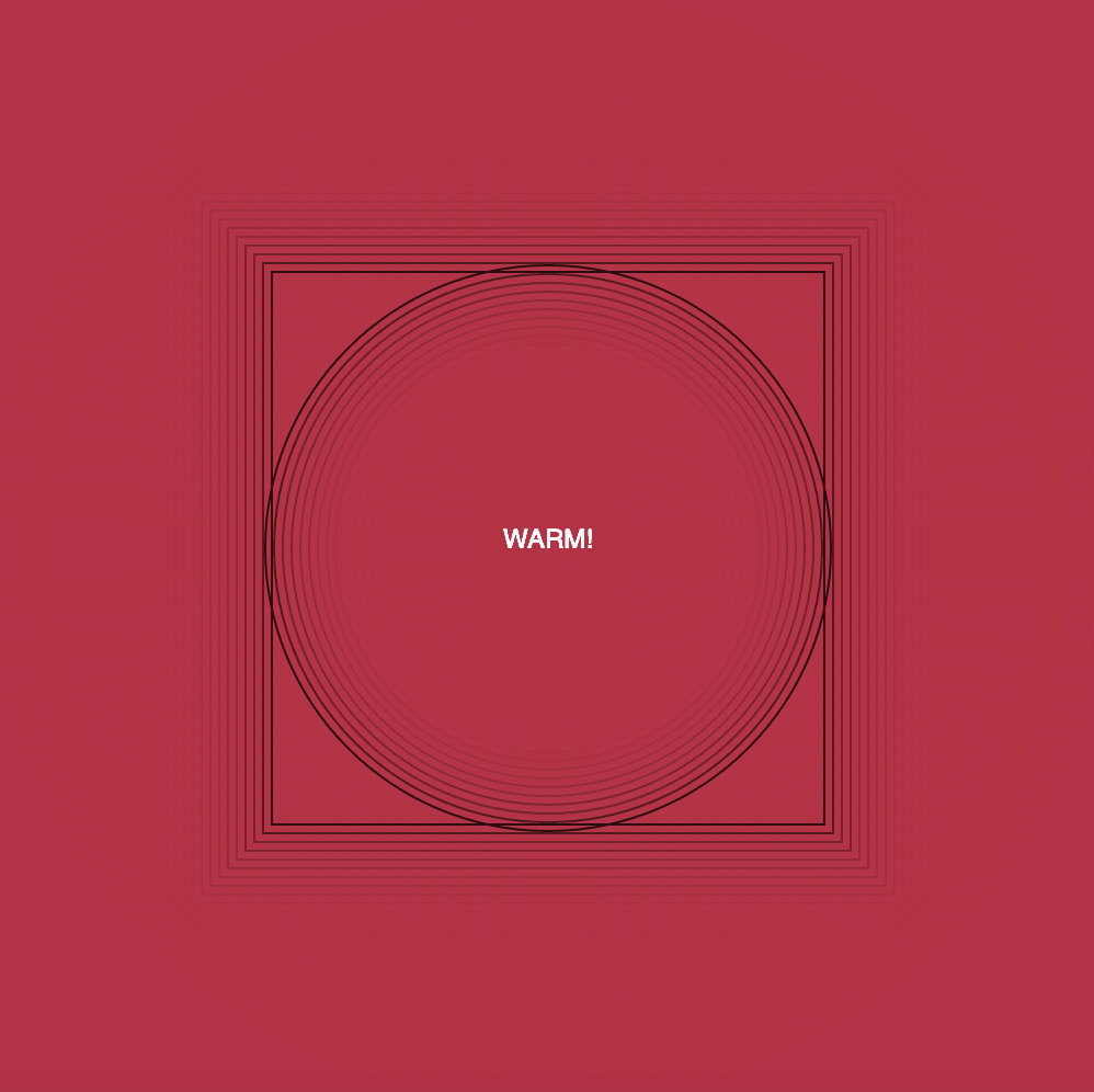
I ran into trouble when adding the square shape; it took a while for me to get it to play nicely with the circle shape. I wanted the shapes to move opposite of one another, so defining the squareSpeed as -2 seemed to have done the trick (shoutout to Carrie for the help). Without that, the square wouldn't act according to how I envisioned. I also had a question about defining the speed settings conditionally too, but a quick Google search gave me insight on what to do: defining the speedMultiplier and its logic.
let activated = false;
let circleSize = 10;
let circleSpeed = 2;
let squareSize = 500;
let squareSpeed = -2;
let speedMultiplier = 1;
© 2019-2026 Marshall Creative Group LLC
Studio